Guide · 14 October 2026 · by Pınar
Chocolate brown leather: the colour a hide is already trying to become
Every colour we put on leather is something done to the hide. Chocolate is the exception — it is the direction a hide travels on its own, given light, oil and ten years of being touched. Which means you can arrive at the season’s colour two completely different ways, and the choice between them is really a choice about whether you want a piece that has finished changing.
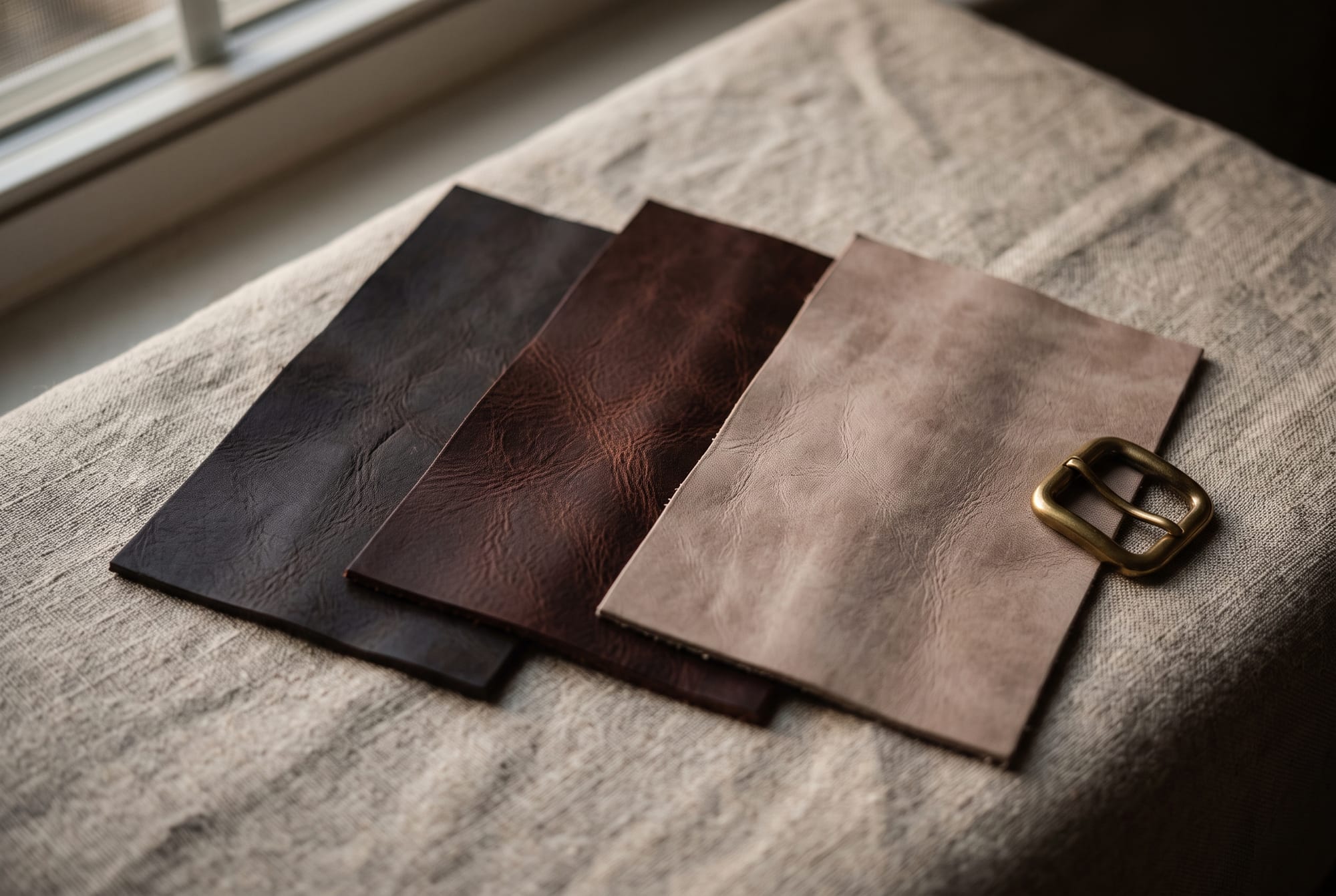
Two pieces come out of the drawer and go down on the linen side by side. Both are chocolate brown. From the doorway they are the same colour.
One was dyed there. The other was a pale biscuit-coloured hide in 2016 and nobody has done anything to it since except carry it.
Up close they are not remotely the same material, and the difference is the only thing I actually want to say about brown.
The colour everything is already heading toward
Chocolate, espresso, mocha, cappuccino — the deep warm browns have been the loudest part of the colour story for two seasons now, and this autumn they have taken over from the burgundy we wrote about last year as the thing everyone calls a new neutral. Suede in chocolate especially; it is close to unavoidable.
I am not going to pretend that is a reason to buy anything. What interests me is that this particular trend has landed on the one colour where leather has an opinion of its own.
Put a green hide in a window for five years and it fights the light. Put a pale vegetable-tanned hide in the same window and it does what it was always going to do: the tannins oxidise, the oils in it warm and migrate, your hands add more, and it goes honey, then tan, then a deep reddish brown. Light darkens and fades a hide at the same time, and on undyed leather the darkening wins by a wide margin.
Every other colour is applied to leather. Chocolate is the one colour a hide is already travelling toward — so the only real question is whether you want to arrive there on day one, or over ten years.
That is not a romantic point. It has a practical consequence that nobody mentions in a product description: a hide dyed chocolate has spent its colour story in advance. It will still burnish, soften, take on shine at the places you hold it and generally become more itself — but it cannot deepen much, because it is already where deepening goes. The pale hide has all of that ahead of it, and it will spend a decade being four or five different colours on the way.
Neither is better. They are different purchases, and knowing which one you are making is most of the value in this piece.
Three browns that keep getting called the same thing
The second problem with this trend is vocabulary. “Brown” is being used for a range that runs from almost-black to milky beige, and the three points on it behave very differently in a room and against clothes.
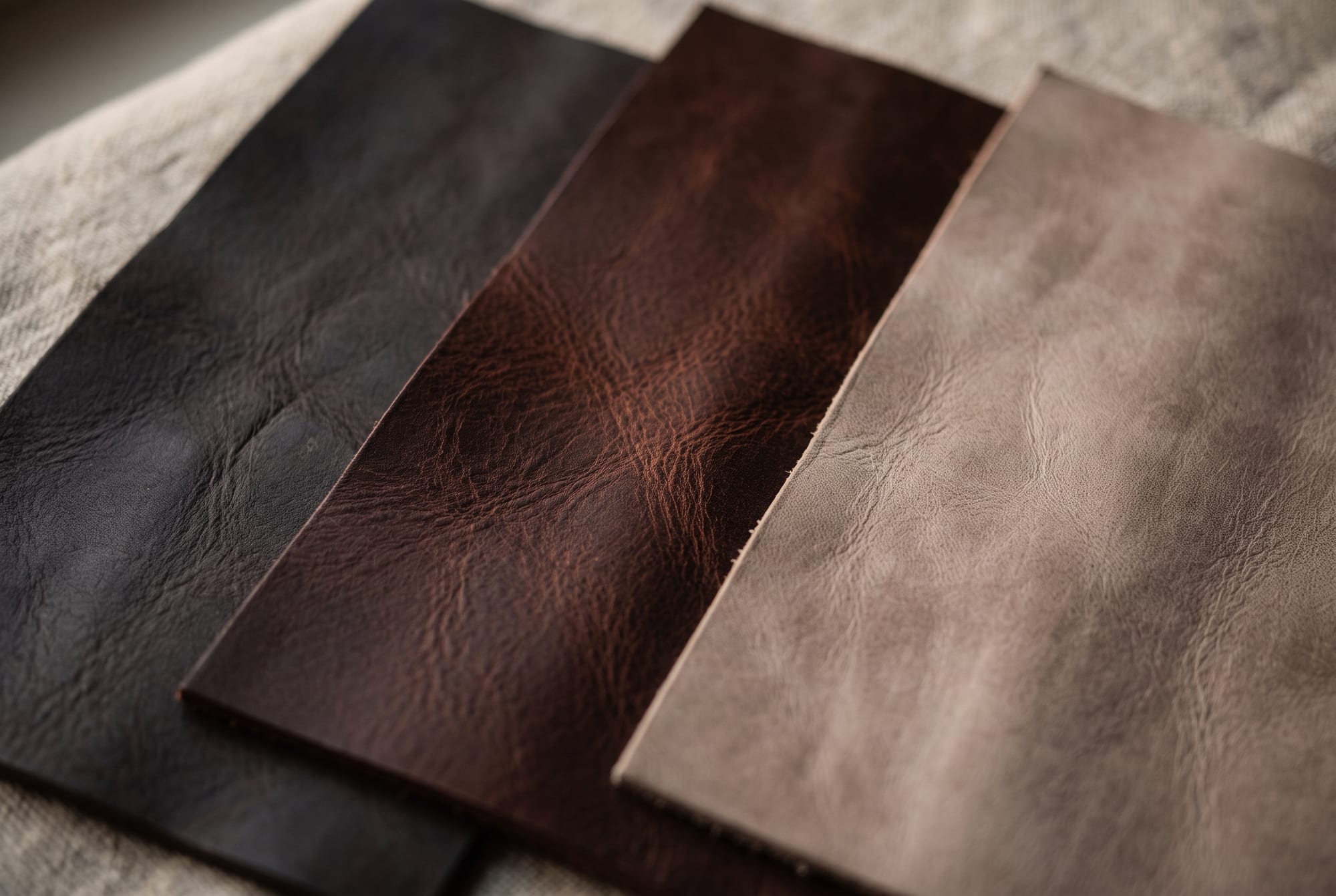
Espresso is the dark end, close enough to black that in evening light it reads as black with something going on inside it. Its undertone is cool — grey, sometimes faintly aubergine. It does the job black does: it punctuates, it anchors, it ends a sentence. Where it beats black is that it does not go flat and dead next to warm materials, which is why an espresso strap sits comfortably on oak and walnut when a black one looks like a cut-out.
Chocolate is the middle and the one actually having the moment. Deep, clearly brown, with a red undertone that comes up when light rakes across it. This is the one that warms a room rather than punctuating it — and it is the only one of the three that most people can wear or furnish with as a true neutral while it is also, unmistakably, a colour.
Mocha is light and greyed — coffee with a lot of milk, and far less warm than it looks on a screen. It is the quietest of the three and the most demanding, because at that lightness every mark shows and there is no depth to hide anything in. A mocha piece asks for a sheltered life. It is also, when it works, the most expensive-looking, which is most of the reason it keeps appearing in the quiet-luxury conversation.
Why chocolate is the colour most likely to look cheap
This is the part I would most like people to take away, because it is the one that decides whether a brown bag looks like the photograph.
Brown’s entire appeal is depth. Not the hue — the sense that light goes into the material and comes back out carrying something. And depth is a property of the finish, not the colour: it needs light to pass into the hide, hit the fibre and the grain, and return. An aniline-dyed hide does this beautifully, because the dye is transparent and the grain is still doing the work. A heavily pigmented or corrected-grain finish paints the surface opaque, and the light stops at the paint.
A bright colour survives that treatment. Red stays red. Brown does not survive it at all — strip the depth out of brown and what is left is the colour of a filing cabinet. It is the same hue and it is a completely different object.
Depth is why brown is beautiful, and depth is the first thing a sprayed finish removes. There is no such thing as a flat chocolate that looks expensive.
So with brown more than any other shade, the thing to look at is not the colour but whether you can still see through it: visible pores, tonal variation across a single panel, a shift when you tilt it to the light. A pull-up leather makes this obvious — the colour lightens where the hide is stretched over a corner, because the oils and dye move. That is the look people are chasing when they say rich, and it is a finish decision rather than a dye decision.
The honest cost of going dark, and the reason I talk people out of espresso more often than into it: the darker the hide, the louder a scratch. The fibre inside a hide is pale, so any mark deep enough to disturb the surface shows up light against dark. On cognac that is nearly invisible. On chocolate it is a fine pale line that will mostly settle and blend as the surface oils redistribute. On espresso it is a pale line against near-black and it does not disappear. Dark leather does not hide damage — it advertises it, which is the exact opposite of what everybody assumes when they choose a dark bag for a toddler.
What it actually goes with
Four pairings I would stand behind, and one warning.
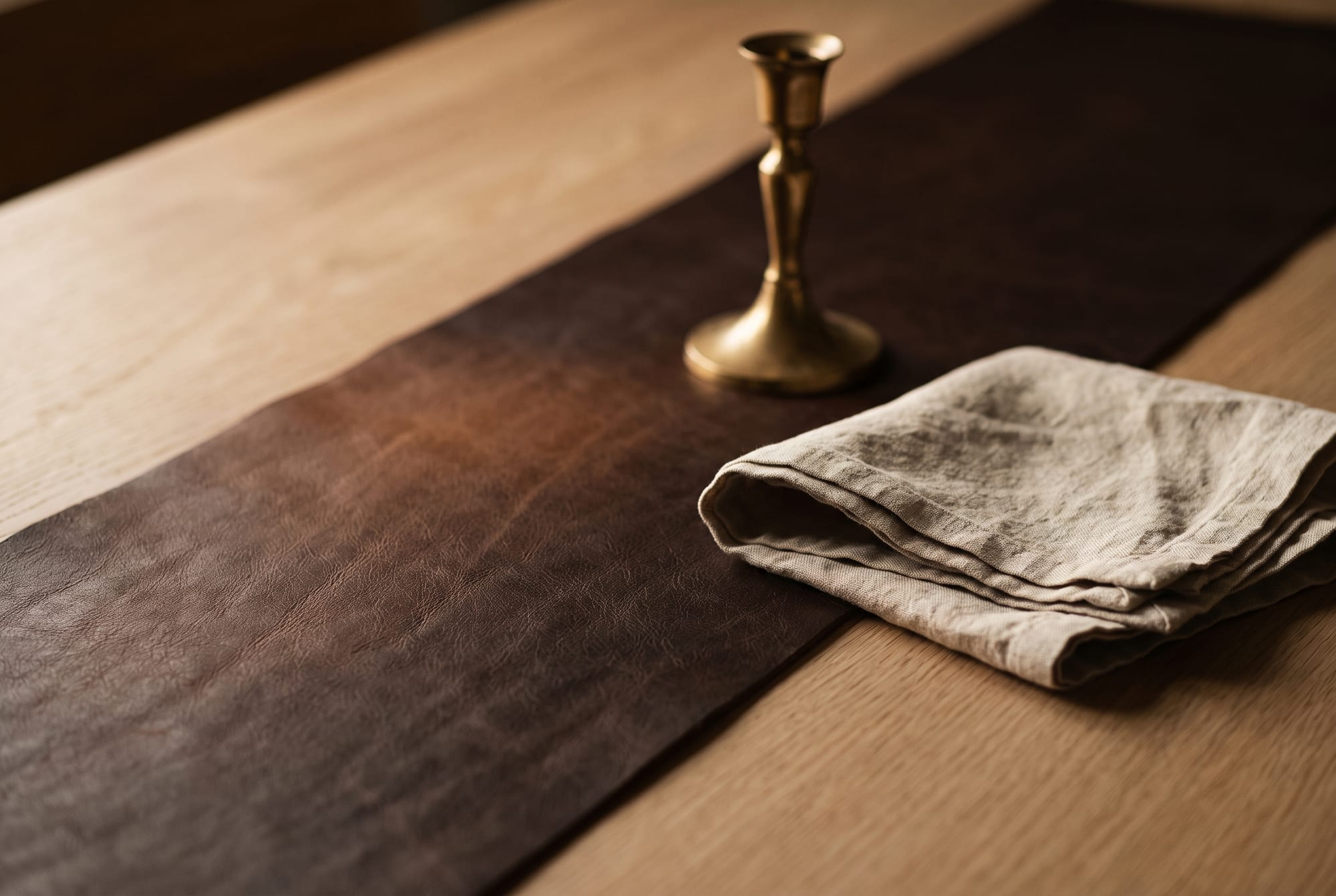
- Oatmeal, cream and raw linen. The easiest and still the best. Chocolate against an undyed natural fibre is the whole palette of this atelier and it never looks like it is trying. Keep the pale thing matte — chocolate next to a glossy white reads cheap instantly.
- Brass, never chrome. Warm metal with a warm colour. Chrome against chocolate puts a cool grey note into a warm field and the eye reads it as a mismatch before it knows why. Unlacquered brass is better still because it goes on changing at roughly the same rate the leather does.
- Oxblood and burgundy. Both already live in chocolate’s red undertone, so this is a tonal pairing rather than a contrast, and it is considerably more interesting than brown with black. The burgundy piece covers the other half of this.
- Olive, and the brown-on-brown stack. Olive is the one unexpected one that always works — both colours are desaturated and both have yellow in them. And the tonal stack is the signature of the season: mocha, chocolate and camel together, with texture doing the separating. Which brings me to the rule that makes tonal dressing work at all: if the colours are close, the materials must not be. Three browns in three different surfaces — suede, smooth hide, knit — reads deliberate. Three browns in the same surface reads like an accident.
The warning is indigo. Chocolate with denim is a lovely thing to look at and a bad thing to do to a pale piece, and even on a dark one it goes one way more than people expect: raw denim gives up its dye readily, especially in warm weather and against uncoated leather. It transfers in both directions and only one of those is reversible.
Three questions
Is chocolate brown leather actually more versatile than black?
In a home, yes, and fairly decisively — almost every interior already contains wood, and wood is warm, so a warm brown joins the room while black sits on top of it. In a wardrobe it depends on what else you own: chocolate is a true neutral against cream, camel, olive, navy and denim, and it is awkward against cool greys and anything with a blue-pink cast. Black is less versatile and more reliable, which is not the same thing.
Will a chocolate bag fade in the sun?
Less dramatically than a pale one, but yes, and unevenly — which is the part that spoils a piece. The failure mode on dark leather is not a general lightening, it is a hard-edged pale rectangle where something sat on it for six months. The fix is even light rather than no light: rotate the piece, or accept that where it lives is where it will record.
Can I darken a tan bag to chocolate myself?
You can darken it, and you cannot aim it. Oil, sun and wear all push a hide toward brown, which is exactly why the second row of that first diagram exists — but applied deliberately it goes blotchy, because it lands wherever the hide happens to be most absorbent, and an over-oiled hide goes limp and sticky as well as dark. If you want chocolate this year, buy chocolate. If you want to watch a hide arrive there, buy it pale and be patient; the colour you get that way is better than anything either of us could apply to it.
Further reading
- Which leather colour should you choose? What each one becomes in ten years
- Burgundy leather: what autumn’s other “new neutral” does on a real hide
- Patina: the story your leather writes about you
- Aniline, semi-aniline, pigmented: what a finish actually decides
- Leather and sunlight: why it darkens and fades at the same time
- Quiet luxury is a material, not a logo